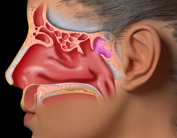
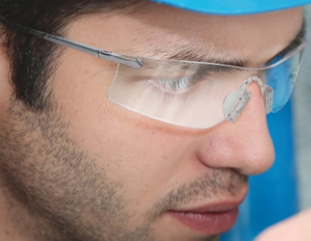
University of Toronto and Amerra Inc. reached out to Predi Designs for assistance with a small medical project on sinuses. They wanted to be able to overlay 2D images of human sinus glands on top of a 3D model of a human for a medical lecture. Predi provided the illustrations they needed to complete the project. Each sinus gland had three different states drawn (Normal, Swollen, and Surgically Fixed).
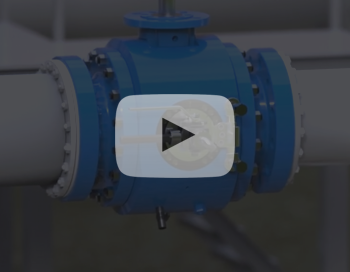
Chaoda Pig Valve
mackerman2019-02-14T05:16:10+00:00Pig valves are used to essentially wipe the interior of a pipe and prevent blockages. Chaoda's latest patented design is unique in that it loads from the side with a latch door that only opens after the valve has been depressurized and drained. This video was made to explain the perks and functionality of this particular design.
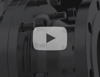
Chaoda 3D Ball Valve
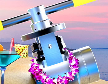
mackerman2019-02-14T05:04:40+00:00Chaoda USA is a valve company that wanted to showcase their product in a more interesting way. Breaking down each part of the valve is the best way to do so. I created a hierarchical part structure for the valve and was able to animate the pieces in a way that both made sense and was visually pleasing to the eye. This valve in particular is called a Metal Seated Ball Valve, because the seats that cradle both sides of the ball are made of metal as well.
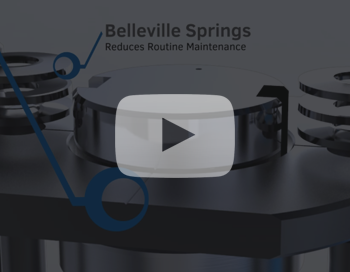
Critical Service Valve
mackerman2019-02-14T04:47:08+00:00COOPER Valves has a product line of metal seated ball valves that are extremely advantageous in many industries. I made these videos for a loop at tradeshows. They would play continuously for several hours. They installed a television in the company's lobby and put the video on loop as well. Many industrial tradeshows get visited by Cooper each year, including POWERGEN, HRSG, AFPM, and more. Cooper Valves was a standout amongst the crowd with these videos, and gathered quite a following.
EnerSafe Prints
mackerman2019-02-14T04:39:38+00:00EnerSafe had a sectionalized branding scheme, in which different colors of the logo represent different aspects of the company. Red is retail, Blue is consulting, Green is environmental, Purple is training, and Orange is safety services. Whenever I designed anything for EnerSafe, I would make a template that utilized white as the accent color, and then modify the white to the 5 color options whenever the template needed specialization. This saturated color scheme is consistent throughout all the company literature, powerpoints, business cards, etc.
Coraline Intro
mackerman2019-02-14T02:14:13+00:00This project was about recreating a movie title sequence. The song, "Opera of the Frogs" by e-d was one that I had DYING to animate for almost eight years. This was my strongest opportunity. I watched Coraline just once and took notes of important characters and plot elements that I could abstract. I wanted to emphasize Coraline's tomboy personality. I make her run instead of walk and animate her hopping in puddles. She's a curious one who explores, ignoring danger along the way. The font was probably the most difficult final decision to make.
Photo Manipulations
mackerman2019-02-14T02:07:36+00:00One of my favorite things to do is create something amazing from an otherwise useless image. Good quality stock photos avoid using products with logos, and most retailers are far behind the times on providing decent product photography. That's where I get to make magic happen by fusing the two problems into a solution. I grab the highest resolution photo of the product that I can and utilize all the features Photoshop has to offer. The end result is always believable, even when carefully scrutinized.
Man Who Won’t Rhyme
mackerman2019-02-14T02:11:15+00:00This short is about a talented lyricist who refuses to be himself. I began writing the plots for Relive Your Life 2 and noticed that a lot of my story tree was getting really political. This contrasted the whimsical and goofy nature of the original game. While perfecting the style for the game, I began animating this short.It features a rhyming narration by Josh Tomar and a very emotional performance by Michael Johnston. Most people relate to the protagonist, even if they are not in the same situation. It's a story about the difficulties of remaining sincere to yourself. This short animation received an Honorable Mention at the Texas Independent Film Festival [...]
Cooper Valves Ads
mackerman2019-02-14T01:44:45+00:00COOPER is much more lenient on what I'm allowed to design. They give me a lot of freedom, and some days I am asked to just make clever ideas for advertisements. These are some of the ads that I've created using Keyshot and Photoshop.A lot of the creation comes from finding useful images and making sure that the 3D render and the backplate image work together in both color and perspective. It helps prevent the product from sticking out like a sore thumb.
Relive Your Life
mackerman2019-02-14T01:30:51+00:00Relive Your Life was my final project for an interactive studio. A second iteration, the first was written with a partner who recorded himself speaking into a camera. After realizing Adobe Flash's limitations, I decided to completely start over and go solo for the final. Clocking in around 35 minutes of simplistic animation, this game was made in its entirety in under a month. Each mini-game was coded by myself with AS2, and I had the pleasure of working with YouTube sensation Arin Hanson (Egoraptor - Game Grumps) for the narration. In Relive Your Life, you begin each journey as a sperm cell defending your egg. From this moment you play a [...]
SAFER Advertisement
mackerman2019-02-14T01:11:10+00:00SAFER Systems has software that allows you to track a chemical release in the air using real-time weather data. It prevents countless lives from being lost in neighboring communities. SAFER's sales team wanted an emotional message to get this idea planted into their customer's heads. I began creating a bunch of sketch ideas for this campaign, and ended up narrowing it down to 12 options. This was the popular choice. The demographic of EHS Managers suggested that most of them would have kids or even grandchildren. I figured showing children under distress would get them more motivated to pay attention to what SAFER had to say.
EnerSafe LED Sign
mackerman2019-02-14T00:57:24+00:00Enersafe had bought a LED sign to have right outside the Midland office, but were only displaying unattractive still images. I took the initiative to follow the brand's colored sectional theme and create a short loop highlighting the three biggest departments at the Midland office.This is by far the best advertising quality in the small town, which has been attracting several more customers ever since the swap was made. The bright, saturated colors were great for grabbing people's attention as they drive down the highway.
Realize Your Alternatives
mackerman2019-02-14T00:44:48+00:00With the purpose of proposing an alternative to paper usage in schools, firstly I needed to emphasize the drastic effect it has on the environment in its current standing. This was done as a graphic design project, but also as a pitch to the Aggie Green Fund for a potential grant. The project was broken into three parts, each initiated by the phrase "Did You Know?" Part one is about highlighting the problem, so it has a red and yellow colorscheme. Part two details the destruction occurring to nature, so the green colors work well here. Part three talks about why nature needs to be preserved, so a comforting blue and pink [...]
Manhattan Project
mackerman2019-02-14T05:18:08+00:00The full title is "Lil' Einstein's Manhattan Project" and it's still one of my favorite games to play. Programmer Andrew Virostek and I started with an idea that a plane would drop a bomb and cause as much destruction as possible through chain reactions. It's a cute premise based on a dark day in history. Make enough money to upgrade your bomb to the atomic bomb before your science project is due. Overall this is a fun and challenging game. The artistic style was chosen to mimic the idea of a paper diorama, and the whole game partakes in Einstein's garage.https://www.newgrounds.com/portal/view/539834
Wedding Designs
mackerman2019-02-13T23:50:03+00:00There are a lot of things required to pull off a wedding and each an every one of them is expensive. We cut costs by having me do all the design work for our own wedding. Our friends also have requested we create some items for their wedding as well. Wedding graphic design is substantially different from the corporate oil and gas industry work that I typically create.
Riceball Root Beer
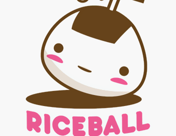
mackerman2019-02-13T23:17:43+00:00Riceball Root Beer is a brand that I created myself for a graphic design course. Starting with a story about a Japanese man who cleaned rice with carbonated beverages, I created a name and logo around the concept. My main inspiration came from Japanese candy packaging, which featured adorable characters and pastel colors.Once the logo was created, business cards came second and then actual bottle packaging. I wanted a cute bottle to incorporate the adorable rounded logo, so I ended up using a sake bottle that I found at a local oriental market.
Digital Artwork
mackerman2019-02-13T23:19:11+00:00This is a small collection of digital character artwork and other paintings that have been done for various projects. Some of the character designs are concepts for 3D projects. They were made for modelers to use as reference. I choose a specific style depending on the purpose of the painting.
Master Smasher
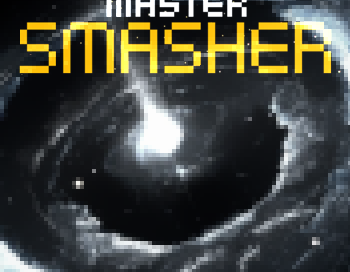
mackerman2019-02-13T21:19:00+00:00For the first three weeks of our game development course, me and three others worked on creating a small prototype called Master Smasher. It revolves around launching a meteor around a gravitational field and destroying all alien spaceships on the current stage. The game got much more interesting when we allowed for the edge case to teleport the meteor to the opposite side of the screen. What initially seemed like a silly idea turned out to be a really fun little strategy game. We used Microsoft XNA and went with a very retro style for the art and audio.It was a favorite among the class and the professor.Currently, the game is not [...]
Field Link Logos
mackerman2019-02-14T00:50:23+00:00I was approached by a man who wanted a new logo for his business, which he was very vague about. From what I was able to gather, he leads an international network of IT and programming experts who are contracted out all over the world 24/7. I would design about 20-30 logos a week and send them to him for feedback. He would always say the same thing -- "These are great! Do you have more?" His feedback was never very helpful and he was difficult to reach, so I continued to create additional logo ideas that popped into my head. After creating about 220 logos, he picked one. This is a [...]
Super Touchdown
mackerman2019-02-13T20:25:02+00:00Full title is "Super Touchdown Happy Extreme". My final project for game development. Working alongside a talented group of programmers, we wanted to try something different. STHX revolves around bastardizing American football in a Japanese setting. It's a silly idea where you attempt to get your football to travel as high and far as possible by throwing and controlling the ball. You have to avoid negative objects and hit positive objects which will lift you up or increase your speed. You can upgrade the ball and your character as each throw gives you a certain amount of money based on your performance. The inspiration for this game stemmed from those like "Toss [...]

