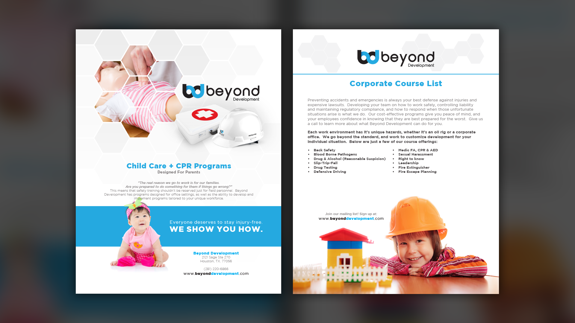
Project Description
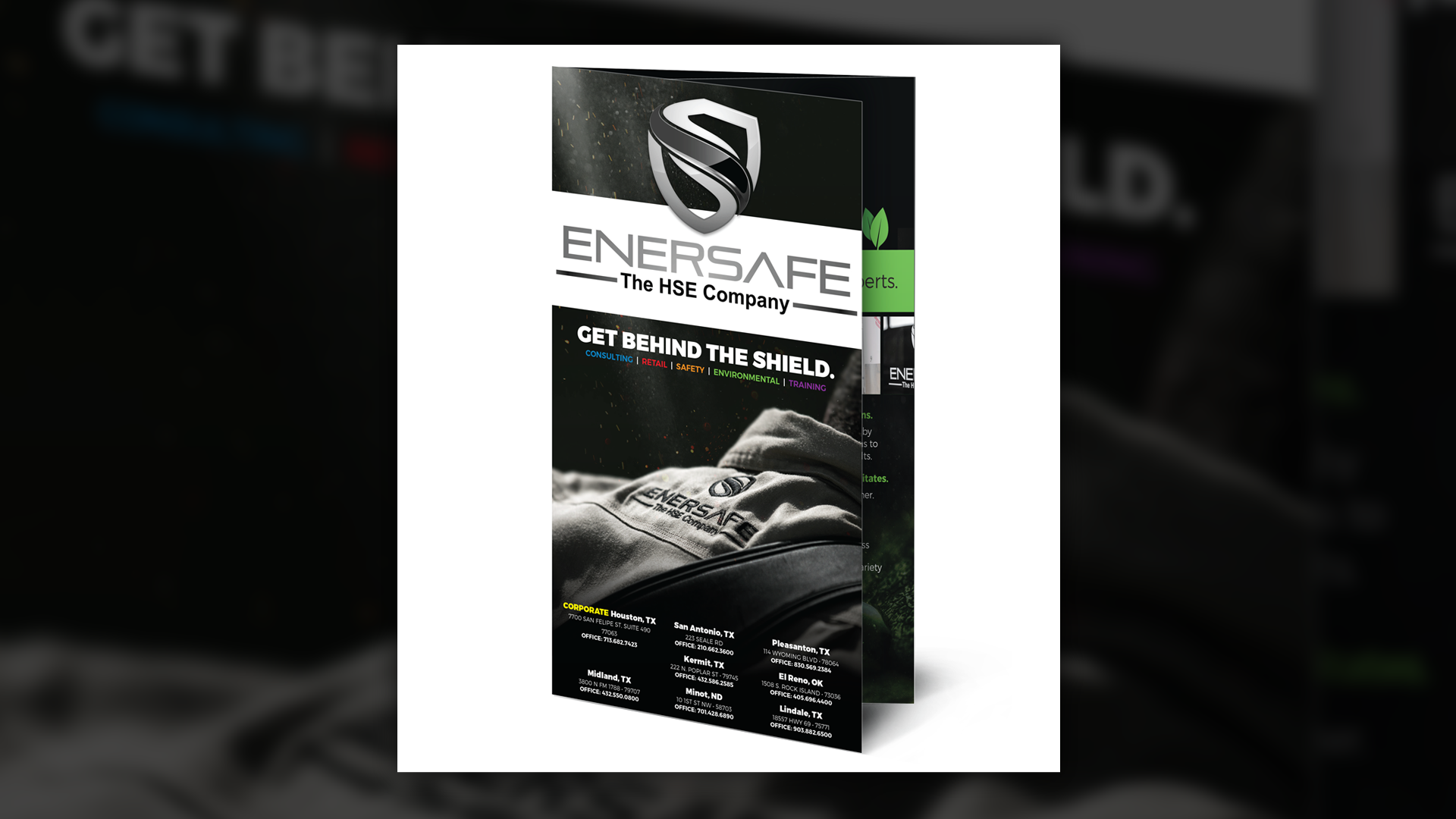
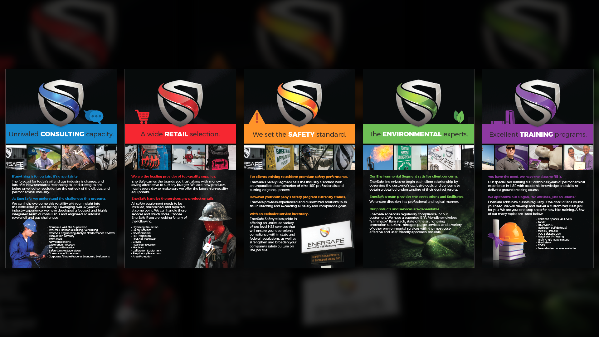
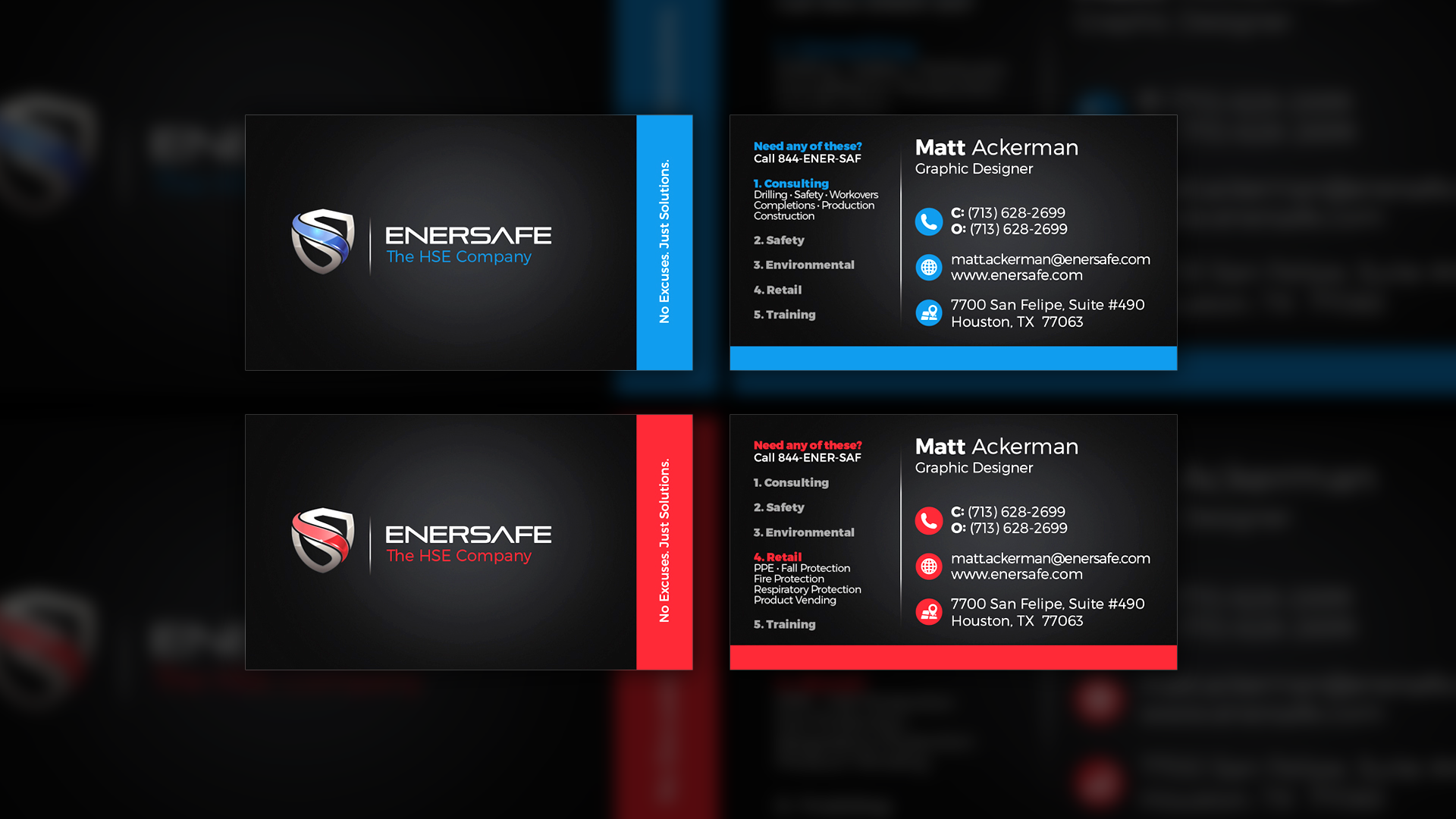
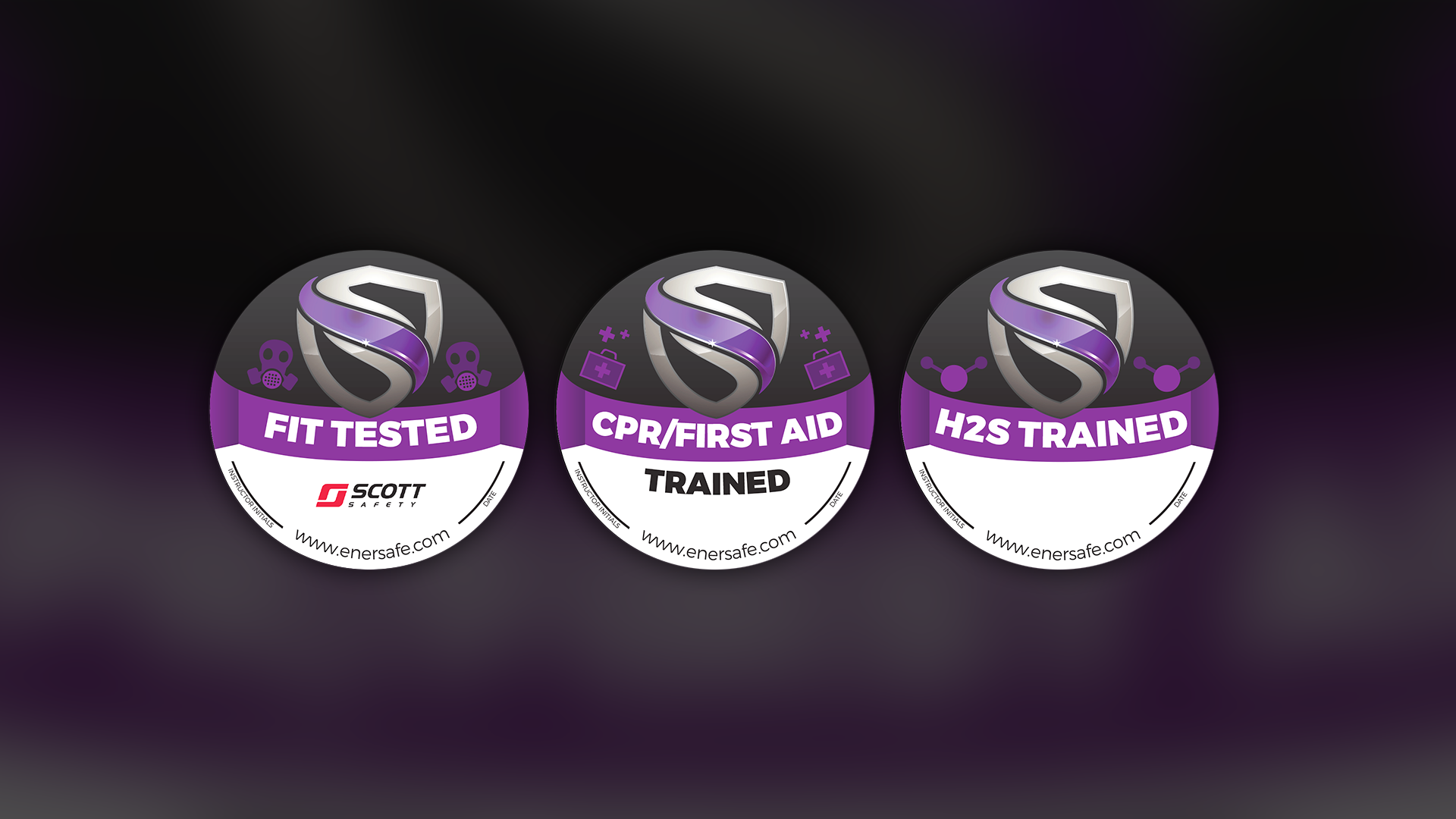
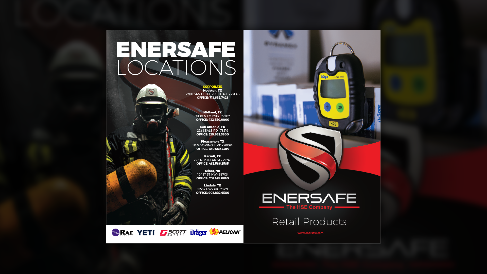
EnerSafe had a sectionalized branding scheme, in which different colors of the logo represent different aspects of the company. Red is retail, Blue is consulting, Green is environmental, Purple is training, and Orange is safety services.
Whenever I designed anything for EnerSafe, I would make a template that utilized white as the accent color, and then modify the white to the 5 color options whenever the template needed specialization. This saturated color scheme is consistent throughout all the company literature, powerpoints, business cards, etc.


