AFAM Capital reaches out to Predi Designs whenever they need some new literature. The Dynamic Portfolio booklet we created for AFAM focused heavily on a theme of “blending” because their investment strategy involves mixing together several different concepts. They also utilize international funds, so they wanted to highlight that aspect of this portfolio.
Chaoda Literature
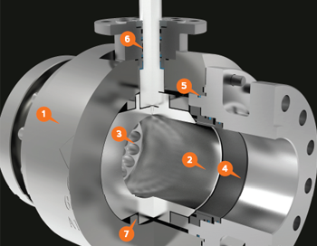
mackerman2019-02-14T23:10:50+00:00Chaoda USA is a Chinese based company that has tapped into the American valve market. They wanted their marketing material to have a more American style and reached out to me to make that happen. I started with 3D models of their valve products and began creating dozens of images in which their valves are shown in the best lighting and materials. From there, I was able to create their brochures, catalogs, cutsheets, website, and many other hand outs!
Ranger Energy Literature
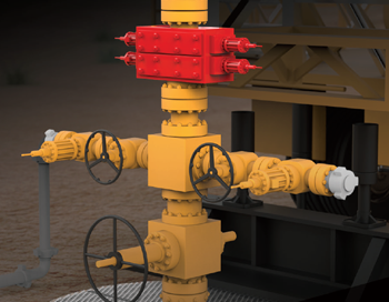
mackerman2021-02-05T16:43:25+00:00Ranger Energy Services is a publicly traded company that provides equipment for the oil and gas industry. Once subscribed to my services, Ranger has been provided with a plethora of design work and animations. They wanted to showcase their mobile rigs, snubbing units, and other fracking equipment. Through 3D Rendering in layers, I was able to provide them with gorgeous images that can darken the background.
Beyond Branding
mackerman2019-02-14T21:53:50+00:00Beyond Development is an online safety training provider that wants to bring the oil and gas industry into the modern world by providing all of their certification training online. Live proctored training online with students all over the country. They wish to be at the forefront of technology in order to become the number one provider of online training. I've created everything they use for marketing, including their logo designs, website, animations, training content, and much more!
Primary
mackerman2019-02-14T21:07:38+00:00Primary was a labor of love between Dave Fulton and I. You are Roy G. Biv, a hero who can alter his color which allows him to reach different platforms and perform special actions. Your world is being sucked of it's color and you need to reach the void at the top of Prizm tower to put a stop to it. Featuring upgrades and boss fights, this is a very challenging and unforgiving platformer. I wanted anything tangible to be saturated with color while background objects remain a stale grey. Each level has a crayon collectible too so it leaves for some re-playability for those who are perfectionists. The level creator used [...]
Investment Portfolio
mackerman2019-02-14T20:57:52+00:00Refuge Real Estate has a large number of properties that they have purchased for low prices and flipped to sell for much higher amounts of money. They often found themselves meeting with banks and lenders for investment opportunities. They needed a portfolio of their successful ventures in order to sell themselves and gain new investors. This booklet provided them all the ammunition they needed.
Edward Haile Branding
mackerman2019-02-14T20:36:18+00:00A client whose brand name has a strong history in the metallurgical industry wanted to revitalize themselves. In over several decades, they never once had a marketing department or a sales team. They were just the "go-to" business for that particular industry need. My decision was to showcase their modernized branding with a contrast of rusted metal. It's not unlike those who place a rustic accent piece in an otherwise brand new modern home. I wanted their branding to say "We're back for your business, but we've been around a long time. We have decades of experience and a whole new attitude." The first day when I met them at their Houston [...]
GryphonESP Retail
mackerman2019-02-14T20:13:48+00:00This catalog was made for GryphonESP in late 2018, and took a lot more effort than meets the eye. Our first request, a report on all the products that GryphonESP sold. I utilized sales numbers and total revenue to filter their list of 4000 products down to 100. Doing so helped organize the categories I would showcase, minimize clutter, and prioritize the top sellers. Product photography was performed for several of the highest sellers of each category in order to provide them with a visual edge. While working on this project, 50+ products were cut with precision to have a completely transparent background, creating a library of images for any future projects [...]
2D Animation Showreel
mackerman2019-02-14T19:47:52+00:00This animation showreel is a small showcase of my 2D animation capabilities. My animations have won various awards and have been featured on local television stations in the Houston area. Some of the animations shown were made for commercial purposes, others for personal projects. Both were added to display a wider range of animation styles that I can do for clientele.
Cooper Literature
mackerman2019-02-20T15:08:37+00:00My first goal when hired at Platform Management was to take their industrial companies to the next level. The smaller industrial companies tend to have a much harder time keeping their brand identity, their look and feel, modernized. After researching how highly respected oil and gas companies have transformed themselves over the years, I gave COOPER a similar treatment. They focus on selling valves made with exotic alloys, so I made sure the imagery had a very clean appearance. Actual valves don't look nearly as attractive. Their catalog was the first project to be undertaken. Once the catalog was established, the rest of the literature and videos just fell into place.
Fresh Cut Lawn
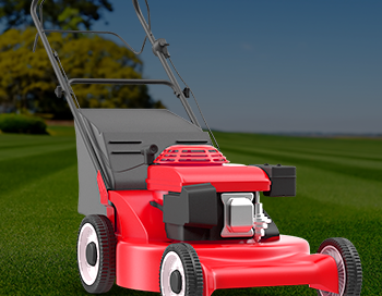
mackerman2019-02-14T18:43:55+00:00A local lawn care company needed a website that incorporated their customer portal login so they could easily pay online. They also needed some hand outs, door hangers, and lawn signs to accumulate more business. The website design is sleek and modern. Their business model is simple, so they wanted the website to reflect that. They already had a logo, so the color scheme I chose had to revolve around that. .01$ per sqft!
Diabetes Relief
mackerman2019-02-14T18:30:21+00:00I was approached by a medical animation company in Houston who needed to outsource a 2D white board animation because their focus is mainly 3D animation. My 2D animation skills are fairly rare in this area, so I worked with their client to create this animation explaining the treatment. The animation was played during a live Houston television interview while an employee and satisfied customer discussed their treatment plan.
Refuge Real Estate
mackerman2019-02-14T06:00:19+00:00My subscription service is perfect for real estate companies as they need weekly cut sheets, mailers, and open house flyers. Refuge Real Estate fully utilizes my services in this regard for a flat monthly fee. Each week is like clockwork - Monday I'd get a new list of open houses for next weekend to create and I'd have them done as soon as possible. There were special events and other happenings that would require my assistance as well.
The Al Frank Way
mackerman2019-02-14T05:39:26+00:00An investment firm in Austin reached out to me to create a few pieces of literature for their sales team to use. This brochure, called "The Al Frank Way" was AFAM Capital's way of telling their history while simultaneously boasting their impressive numbers. They wanted this brochure to be geared towards older generations as the main theme is low-risk long term investments.
EnerSafe Prints
mackerman2019-02-14T04:39:38+00:00EnerSafe had a sectionalized branding scheme, in which different colors of the logo represent different aspects of the company. Red is retail, Blue is consulting, Green is environmental, Purple is training, and Orange is safety services. Whenever I designed anything for EnerSafe, I would make a template that utilized white as the accent color, and then modify the white to the 5 color options whenever the template needed specialization. This saturated color scheme is consistent throughout all the company literature, powerpoints, business cards, etc.
Relive Your Life
mackerman2019-02-14T01:30:51+00:00Relive Your Life was my final project for an interactive studio. A second iteration, the first was written with a partner who recorded himself speaking into a camera. After realizing Adobe Flash's limitations, I decided to completely start over and go solo for the final. Clocking in around 35 minutes of simplistic animation, this game was made in its entirety in under a month. Each mini-game was coded by myself with AS2, and I had the pleasure of working with YouTube sensation Arin Hanson (Egoraptor - Game Grumps) for the narration. In Relive Your Life, you begin each journey as a sperm cell defending your egg. From this moment you play a [...]
EnerSafe LED Sign
mackerman2019-02-14T00:57:24+00:00Enersafe had bought a LED sign to have right outside the Midland office, but were only displaying unattractive still images. I took the initiative to follow the brand's colored sectional theme and create a short loop highlighting the three biggest departments at the Midland office.This is by far the best advertising quality in the small town, which has been attracting several more customers ever since the swap was made. The bright, saturated colors were great for grabbing people's attention as they drive down the highway.
Wedding Designs
mackerman2019-02-13T23:50:03+00:00There are a lot of things required to pull off a wedding and each an every one of them is expensive. We cut costs by having me do all the design work for our own wedding. Our friends also have requested we create some items for their wedding as well. Wedding graphic design is substantially different from the corporate oil and gas industry work that I typically create.
Riceball Root Beer
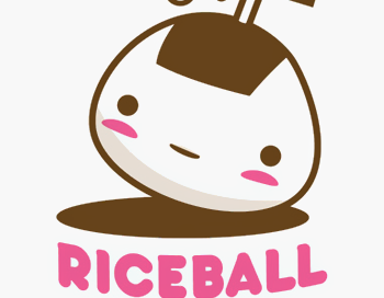
mackerman2019-02-13T23:17:43+00:00Riceball Root Beer is a brand that I created myself for a graphic design course. Starting with a story about a Japanese man who cleaned rice with carbonated beverages, I created a name and logo around the concept. My main inspiration came from Japanese candy packaging, which featured adorable characters and pastel colors.Once the logo was created, business cards came second and then actual bottle packaging. I wanted a cute bottle to incorporate the adorable rounded logo, so I ended up using a sake bottle that I found at a local oriental market.
Digital Artwork
mackerman2019-02-13T23:19:11+00:00This is a small collection of digital character artwork and other paintings that have been done for various projects. Some of the character designs are concepts for 3D projects. They were made for modelers to use as reference. I choose a specific style depending on the purpose of the painting.

