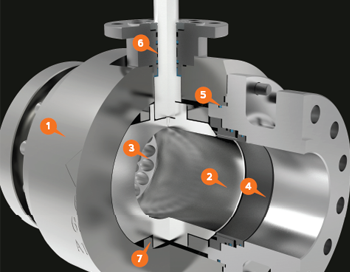
Chaoda USA is a Chinese based company that has tapped into the American valve market. They wanted their marketing material to have a more American style and reached out to me to make that happen. I started with 3D models of their valve products and began creating dozens of images in which their valves are shown in the best lighting and materials. From there, I was able to create their brochures, catalogs, cutsheets, website, and many other hand outs!
Ranger Energy Literature
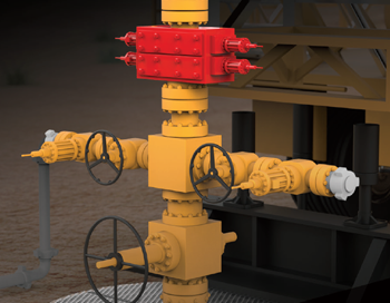
mackerman2021-02-05T16:43:25+00:00Ranger Energy Services is a publicly traded company that provides equipment for the oil and gas industry. Once subscribed to my services, Ranger has been provided with a plethora of design work and animations. They wanted to showcase their mobile rigs, snubbing units, and other fracking equipment. Through 3D Rendering in layers, I was able to provide them with gorgeous images that can darken the background.
Beyond Branding
mackerman2019-02-14T21:53:50+00:00Beyond Development is an online safety training provider that wants to bring the oil and gas industry into the modern world by providing all of their certification training online. Live proctored training online with students all over the country. They wish to be at the forefront of technology in order to become the number one provider of online training. I've created everything they use for marketing, including their logo designs, website, animations, training content, and much more!
Edward Haile Branding
mackerman2019-02-14T20:36:18+00:00A client whose brand name has a strong history in the metallurgical industry wanted to revitalize themselves. In over several decades, they never once had a marketing department or a sales team. They were just the "go-to" business for that particular industry need. My decision was to showcase their modernized branding with a contrast of rusted metal. It's not unlike those who place a rustic accent piece in an otherwise brand new modern home. I wanted their branding to say "We're back for your business, but we've been around a long time. We have decades of experience and a whole new attitude." The first day when I met them at their Houston [...]
Fresh Cut Lawn
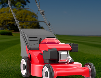
mackerman2019-02-14T18:43:55+00:00A local lawn care company needed a website that incorporated their customer portal login so they could easily pay online. They also needed some hand outs, door hangers, and lawn signs to accumulate more business. The website design is sleek and modern. Their business model is simple, so they wanted the website to reflect that. They already had a logo, so the color scheme I chose had to revolve around that. .01$ per sqft!
Refuge Real Estate
mackerman2019-02-14T06:00:19+00:00My subscription service is perfect for real estate companies as they need weekly cut sheets, mailers, and open house flyers. Refuge Real Estate fully utilizes my services in this regard for a flat monthly fee. Each week is like clockwork - Monday I'd get a new list of open houses for next weekend to create and I'd have them done as soon as possible. There were special events and other happenings that would require my assistance as well.
EnerSafe Prints
mackerman2019-02-14T04:39:38+00:00EnerSafe had a sectionalized branding scheme, in which different colors of the logo represent different aspects of the company. Red is retail, Blue is consulting, Green is environmental, Purple is training, and Orange is safety services. Whenever I designed anything for EnerSafe, I would make a template that utilized white as the accent color, and then modify the white to the 5 color options whenever the template needed specialization. This saturated color scheme is consistent throughout all the company literature, powerpoints, business cards, etc.

