AFAM Capital reaches out to Predi Designs whenever they need some new literature. The Dynamic Portfolio booklet we created for AFAM focused heavily on a theme of “blending” because their investment strategy involves mixing together several different concepts. They also utilize international funds, so they wanted to highlight that aspect of this portfolio.
Ranger Energy Literature
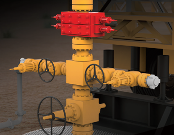
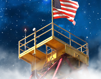
mackerman2021-02-05T16:43:25+00:00Ranger Energy Services is a publicly traded company that provides equipment for the oil and gas industry. Once subscribed to my services, Ranger has been provided with a plethora of design work and animations. They wanted to showcase their mobile rigs, snubbing units, and other fracking equipment. Through 3D Rendering in layers, I was able to provide them with gorgeous images that can darken the background.
Primary
mackerman2019-02-14T21:07:38+00:00Primary was a labor of love between Dave Fulton and I. You are Roy G. Biv, a hero who can alter his color which allows him to reach different platforms and perform special actions. Your world is being sucked of it's color and you need to reach the void at the top of Prizm tower to put a stop to it. Featuring upgrades and boss fights, this is a very challenging and unforgiving platformer. I wanted anything tangible to be saturated with color while background objects remain a stale grey. Each level has a crayon collectible too so it leaves for some re-playability for those who are perfectionists. The level creator used [...]
Beyond Website
mackerman2019-02-14T20:43:43+00:00Beyond Development is an online safety training company that provides live proctored HSE training to anyone with an internet connection. The company has taken full advantage of my capabilities to create 3D animations, 2D animations, and their current website. The website has several neat css/js animation features implemented. https://www.beyonddevelopment.com/
Edward Haile Branding
mackerman2019-02-14T20:36:18+00:00A client whose brand name has a strong history in the metallurgical industry wanted to revitalize themselves. In over several decades, they never once had a marketing department or a sales team. They were just the "go-to" business for that particular industry need. My decision was to showcase their modernized branding with a contrast of rusted metal. It's not unlike those who place a rustic accent piece in an otherwise brand new modern home. I wanted their branding to say "We're back for your business, but we've been around a long time. We have decades of experience and a whole new attitude." The first day when I met them at their Houston [...]
3D Animation Showreel
mackerman2019-02-14T19:43:48+00:00This showreel is focused on 3D Animations created underneath my graphic design subscription business, as a contractor. Companies like to utilize 3D as a unique way to display their products. It’s more fun to look at than a static image. Several valve companies in the area found my quality of work to be well worth it, which is why a majority of this video is about valves. I put a lot of effort into materials and lighting so your product looks as pristine as possible.
Symphonic Tower Defense
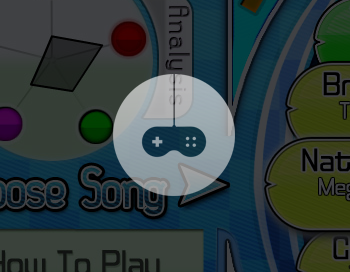
mackerman2019-02-14T19:21:49+00:00Symphonic Tower Defense is a solid flash game created by Jon Sandness and myself. Using both Flash and Photoshop, I animated all the effects and designed the layout of the game. It's a tower-defense that revolves around the music playing at the time. We started off planning to use one ridiculously long song, but over time we realized that single short levels were way more fun. Each tower type gets a boost from a particular instrument of the song. The menus were inspired by music games like Dance Dance Revolution and the actual gameplay area uses a lot of musical elements. Some of our most enthusiastic evangelists are musicians who really appreciated [...]
Product Photography
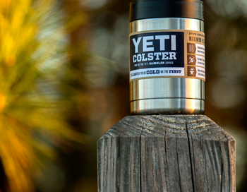
mackerman2019-02-14T19:10:56+00:00Armed with a company-owned DSLR camera and a magnificient zoom lens, I fully utilized our stocked inventory to create images that I could later use in the Enersafe retail catalog. It's essential for me to have top-quality photographs, as I won't be okay with settling for anything less. I would try to find places that have a very textured surface to clash with the pristine nature of the product itself. Most of the images shown here work well in the setting, as these products are advertised for the outdoors.
Cooper Literature
mackerman2019-02-20T15:08:37+00:00My first goal when hired at Platform Management was to take their industrial companies to the next level. The smaller industrial companies tend to have a much harder time keeping their brand identity, their look and feel, modernized. After researching how highly respected oil and gas companies have transformed themselves over the years, I gave COOPER a similar treatment. They focus on selling valves made with exotic alloys, so I made sure the imagery had a very clean appearance. Actual valves don't look nearly as attractive. Their catalog was the first project to be undertaken. Once the catalog was established, the rest of the literature and videos just fell into place.
Fresh Cut Lawn
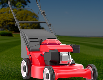
mackerman2019-02-14T18:43:55+00:00A local lawn care company needed a website that incorporated their customer portal login so they could easily pay online. They also needed some hand outs, door hangers, and lawn signs to accumulate more business. The website design is sleek and modern. Their business model is simple, so they wanted the website to reflect that. They already had a logo, so the color scheme I chose had to revolve around that. .01$ per sqft!
Refuge Real Estate
mackerman2019-02-14T06:00:19+00:00My subscription service is perfect for real estate companies as they need weekly cut sheets, mailers, and open house flyers. Refuge Real Estate fully utilizes my services in this regard for a flat monthly fee. Each week is like clockwork - Monday I'd get a new list of open houses for next weekend to create and I'd have them done as soon as possible. There were special events and other happenings that would require my assistance as well.
The Al Frank Way
mackerman2019-02-14T05:39:26+00:00An investment firm in Austin reached out to me to create a few pieces of literature for their sales team to use. This brochure, called "The Al Frank Way" was AFAM Capital's way of telling their history while simultaneously boasting their impressive numbers. They wanted this brochure to be geared towards older generations as the main theme is low-risk long term investments.
EnerSafe Prints
mackerman2019-02-14T04:39:38+00:00EnerSafe had a sectionalized branding scheme, in which different colors of the logo represent different aspects of the company. Red is retail, Blue is consulting, Green is environmental, Purple is training, and Orange is safety services. Whenever I designed anything for EnerSafe, I would make a template that utilized white as the accent color, and then modify the white to the 5 color options whenever the template needed specialization. This saturated color scheme is consistent throughout all the company literature, powerpoints, business cards, etc.
SAFER Advertisement
mackerman2019-02-14T01:11:10+00:00SAFER Systems has software that allows you to track a chemical release in the air using real-time weather data. It prevents countless lives from being lost in neighboring communities. SAFER's sales team wanted an emotional message to get this idea planted into their customer's heads. I began creating a bunch of sketch ideas for this campaign, and ended up narrowing it down to 12 options. This was the popular choice. The demographic of EHS Managers suggested that most of them would have kids or even grandchildren. I figured showing children under distress would get them more motivated to pay attention to what SAFER had to say.
Riceball Root Beer
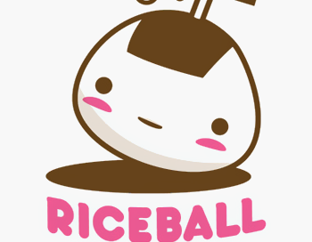
mackerman2019-02-13T23:17:43+00:00Riceball Root Beer is a brand that I created myself for a graphic design course. Starting with a story about a Japanese man who cleaned rice with carbonated beverages, I created a name and logo around the concept. My main inspiration came from Japanese candy packaging, which featured adorable characters and pastel colors.Once the logo was created, business cards came second and then actual bottle packaging. I wanted a cute bottle to incorporate the adorable rounded logo, so I ended up using a sake bottle that I found at a local oriental market.
Field Link Logos
mackerman2019-02-14T00:50:23+00:00I was approached by a man who wanted a new logo for his business, which he was very vague about. From what I was able to gather, he leads an international network of IT and programming experts who are contracted out all over the world 24/7. I would design about 20-30 logos a week and send them to him for feedback. He would always say the same thing -- "These are great! Do you have more?" His feedback was never very helpful and he was difficult to reach, so I continued to create additional logo ideas that popped into my head. After creating about 220 logos, he picked one. This is a [...]
Super Touchdown
mackerman2019-02-13T20:25:02+00:00Full title is "Super Touchdown Happy Extreme". My final project for game development. Working alongside a talented group of programmers, we wanted to try something different. STHX revolves around bastardizing American football in a Japanese setting. It's a silly idea where you attempt to get your football to travel as high and far as possible by throwing and controlling the ball. You have to avoid negative objects and hit positive objects which will lift you up or increase your speed. You can upgrade the ball and your character as each throw gives you a certain amount of money based on your performance. The inspiration for this game stemmed from those like "Toss [...]

