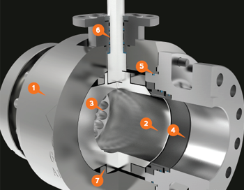
Chaoda USA is a Chinese based company that has tapped into the American valve market. They wanted their marketing material to have a more American style and reached out to me to make that happen. I started with 3D models of their valve products and began creating dozens of images in which their valves are shown in the best lighting and materials. From there, I was able to create their brochures, catalogs, cutsheets, website, and many other hand outs!
Beyond Branding
mackerman2019-02-14T21:53:50+00:00Beyond Development is an online safety training provider that wants to bring the oil and gas industry into the modern world by providing all of their certification training online. Live proctored training online with students all over the country. They wish to be at the forefront of technology in order to become the number one provider of online training. I've created everything they use for marketing, including their logo designs, website, animations, training content, and much more!
Beyond Website
mackerman2019-02-14T20:43:43+00:00Beyond Development is an online safety training company that provides live proctored HSE training to anyone with an internet connection. The company has taken full advantage of my capabilities to create 3D animations, 2D animations, and their current website. The website has several neat css/js animation features implemented. https://www.beyonddevelopment.com/
Amazon HQ2
mackerman2019-02-14T19:35:30+00:00Client wanted Amazon to bring their second headquarters to Houston, Texas. They owned and operated a large chunk of property in the north east side of Houston, titled Generation Park. They put together a sales presentation and asked me to create a website that would walk Amazon through all the many perks Generation Park holds. The website was created within 48 hours. Unfortunately, Amazon did not choose Houston for their next location. http://www.amazonhq2texas.com/
Fresh Cut Lawn
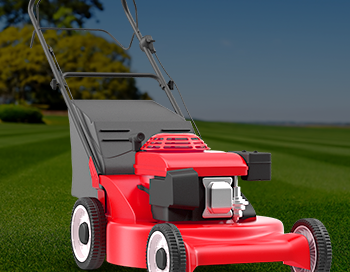
mackerman2019-02-14T18:43:55+00:00A local lawn care company needed a website that incorporated their customer portal login so they could easily pay online. They also needed some hand outs, door hangers, and lawn signs to accumulate more business. The website design is sleek and modern. Their business model is simple, so they wanted the website to reflect that. They already had a logo, so the color scheme I chose had to revolve around that. .01$ per sqft!


