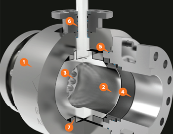
Chaoda USA is a Chinese based company that has tapped into the American valve market. They wanted their marketing material to have a more American style and reached out to me to make that happen. I started with 3D models of their valve products and began creating dozens of images in which their valves are shown in the best lighting and materials. From there, I was able to create their brochures, catalogs, cutsheets, website, and many other hand outs!
Ranger Energy Literature
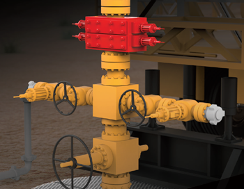
mackerman2021-02-05T16:43:25+00:00Ranger Energy Services is a publicly traded company that provides equipment for the oil and gas industry. Once subscribed to my services, Ranger has been provided with a plethora of design work and animations. They wanted to showcase their mobile rigs, snubbing units, and other fracking equipment. Through 3D Rendering in layers, I was able to provide them with gorgeous images that can darken the background.
Beyond Branding
mackerman2019-02-14T21:53:50+00:00Beyond Development is an online safety training provider that wants to bring the oil and gas industry into the modern world by providing all of their certification training online. Live proctored training online with students all over the country. They wish to be at the forefront of technology in order to become the number one provider of online training. I've created everything they use for marketing, including their logo designs, website, animations, training content, and much more!
Investment Portfolio
mackerman2019-02-14T20:57:52+00:00Refuge Real Estate has a large number of properties that they have purchased for low prices and flipped to sell for much higher amounts of money. They often found themselves meeting with banks and lenders for investment opportunities. They needed a portfolio of their successful ventures in order to sell themselves and gain new investors. This booklet provided them all the ammunition they needed.
Edward Haile Branding
mackerman2019-02-14T20:36:18+00:00A client whose brand name has a strong history in the metallurgical industry wanted to revitalize themselves. In over several decades, they never once had a marketing department or a sales team. They were just the "go-to" business for that particular industry need. My decision was to showcase their modernized branding with a contrast of rusted metal. It's not unlike those who place a rustic accent piece in an otherwise brand new modern home. I wanted their branding to say "We're back for your business, but we've been around a long time. We have decades of experience and a whole new attitude." The first day when I met them at their Houston [...]
GryphonESP Retail
mackerman2019-02-14T20:13:48+00:00This catalog was made for GryphonESP in late 2018, and took a lot more effort than meets the eye. Our first request, a report on all the products that GryphonESP sold. I utilized sales numbers and total revenue to filter their list of 4000 products down to 100. Doing so helped organize the categories I would showcase, minimize clutter, and prioritize the top sellers. Product photography was performed for several of the highest sellers of each category in order to provide them with a visual edge. While working on this project, 50+ products were cut with precision to have a completely transparent background, creating a library of images for any future projects [...]
Amazon HQ2
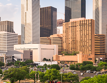
mackerman2019-02-14T19:35:30+00:00Client wanted Amazon to bring their second headquarters to Houston, Texas. They owned and operated a large chunk of property in the north east side of Houston, titled Generation Park. They put together a sales presentation and asked me to create a website that would walk Amazon through all the many perks Generation Park holds. The website was created within 48 hours. Unfortunately, Amazon did not choose Houston for their next location. http://www.amazonhq2texas.com/
Product Photography
mackerman2019-02-14T19:10:56+00:00Armed with a company-owned DSLR camera and a magnificient zoom lens, I fully utilized our stocked inventory to create images that I could later use in the Enersafe retail catalog. It's essential for me to have top-quality photographs, as I won't be okay with settling for anything less. I would try to find places that have a very textured surface to clash with the pristine nature of the product itself. Most of the images shown here work well in the setting, as these products are advertised for the outdoors.
Cooper Literature
mackerman2019-02-20T15:08:37+00:00My first goal when hired at Platform Management was to take their industrial companies to the next level. The smaller industrial companies tend to have a much harder time keeping their brand identity, their look and feel, modernized. After researching how highly respected oil and gas companies have transformed themselves over the years, I gave COOPER a similar treatment. They focus on selling valves made with exotic alloys, so I made sure the imagery had a very clean appearance. Actual valves don't look nearly as attractive. Their catalog was the first project to be undertaken. Once the catalog was established, the rest of the literature and videos just fell into place.
Fresh Cut Lawn
mackerman2019-02-14T18:43:55+00:00A local lawn care company needed a website that incorporated their customer portal login so they could easily pay online. They also needed some hand outs, door hangers, and lawn signs to accumulate more business. The website design is sleek and modern. Their business model is simple, so they wanted the website to reflect that. They already had a logo, so the color scheme I chose had to revolve around that. .01$ per sqft!
Refuge Real Estate
mackerman2019-02-14T06:00:19+00:00My subscription service is perfect for real estate companies as they need weekly cut sheets, mailers, and open house flyers. Refuge Real Estate fully utilizes my services in this regard for a flat monthly fee. Each week is like clockwork - Monday I'd get a new list of open houses for next weekend to create and I'd have them done as soon as possible. There were special events and other happenings that would require my assistance as well.
Photo Manipulations
mackerman2019-02-14T02:07:36+00:00One of my favorite things to do is create something amazing from an otherwise useless image. Good quality stock photos avoid using products with logos, and most retailers are far behind the times on providing decent product photography. That's where I get to make magic happen by fusing the two problems into a solution. I grab the highest resolution photo of the product that I can and utilize all the features Photoshop has to offer. The end result is always believable, even when carefully scrutinized.
SAFER Advertisement
mackerman2019-02-14T01:11:10+00:00SAFER Systems has software that allows you to track a chemical release in the air using real-time weather data. It prevents countless lives from being lost in neighboring communities. SAFER's sales team wanted an emotional message to get this idea planted into their customer's heads. I began creating a bunch of sketch ideas for this campaign, and ended up narrowing it down to 12 options. This was the popular choice. The demographic of EHS Managers suggested that most of them would have kids or even grandchildren. I figured showing children under distress would get them more motivated to pay attention to what SAFER had to say.
EnerSafe LED Sign
mackerman2019-02-14T00:57:24+00:00Enersafe had bought a LED sign to have right outside the Midland office, but were only displaying unattractive still images. I took the initiative to follow the brand's colored sectional theme and create a short loop highlighting the three biggest departments at the Midland office.This is by far the best advertising quality in the small town, which has been attracting several more customers ever since the swap was made. The bright, saturated colors were great for grabbing people's attention as they drive down the highway.
Digital Artwork
mackerman2019-02-13T23:19:11+00:00This is a small collection of digital character artwork and other paintings that have been done for various projects. Some of the character designs are concepts for 3D projects. They were made for modelers to use as reference. I choose a specific style depending on the purpose of the painting.

