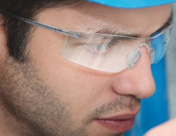
Armed with a company-owned DSLR camera and a magnificient zoom lens, I fully utilized our stocked inventory to create images that I could later use in the Enersafe retail catalog. It's essential for me to have top-quality photographs, as I won't be okay with settling for anything less. I would try to find places that have a very textured surface to clash with the pristine nature of the product itself. Most of the images shown here work well in the setting, as these products are advertised for the outdoors.
Sinus Illustrations
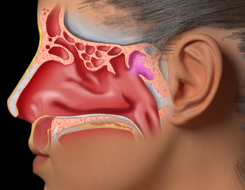
mackerman2019-02-14T05:27:44+00:00University of Toronto and Amerra Inc. reached out to Predi Designs for assistance with a small medical project on sinuses. They wanted to be able to overlay 2D images of human sinus glands on top of a 3D model of a human for a medical lecture. Predi provided the illustrations they needed to complete the project. Each sinus gland had three different states drawn (Normal, Swollen, and Surgically Fixed).
Photo Manipulations
mackerman2019-02-14T02:07:36+00:00One of my favorite things to do is create something amazing from an otherwise useless image. Good quality stock photos avoid using products with logos, and most retailers are far behind the times on providing decent product photography. That's where I get to make magic happen by fusing the two problems into a solution. I grab the highest resolution photo of the product that I can and utilize all the features Photoshop has to offer. The end result is always believable, even when carefully scrutinized.
SAFER Advertisement
mackerman2019-02-14T01:11:10+00:00SAFER Systems has software that allows you to track a chemical release in the air using real-time weather data. It prevents countless lives from being lost in neighboring communities. SAFER's sales team wanted an emotional message to get this idea planted into their customer's heads. I began creating a bunch of sketch ideas for this campaign, and ended up narrowing it down to 12 options. This was the popular choice. The demographic of EHS Managers suggested that most of them would have kids or even grandchildren. I figured showing children under distress would get them more motivated to pay attention to what SAFER had to say.
Into The Shadows
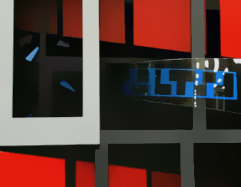
mackerman2019-02-14T00:39:09+00:00Starting with a Kinect camera, TouchDesigner, a projector, and a few more webcameras, Laura Murphy and I set up a system that utilized projection mapping's most apparent flaw. Shadows cast by the projector are an important factor, rather than a hindrance, with our setup.We then gave the system to the Texas A&M dance department, where they created costumes and choreographed a dance that took full advantage of the technology. The video explains the whole process.
Fireflies
mackerman2019-02-14T00:40:42+00:00This project utilized a kinect camera's joint data to track joint angles and hand motions. Based on the user's movements, colored fireflies would spawn and the user's hands could influence them significantly.We gave our program to the dance department at A&M to test and critique. They decided to use our system for a small performance to show the art in action. Interactive pieces like these have a lot of potential. It was a lot of fun to essentially toss light around using your body movement.
Digital Artwork
mackerman2019-02-13T23:19:11+00:00This is a small collection of digital character artwork and other paintings that have been done for various projects. Some of the character designs are concepts for 3D projects. They were made for modelers to use as reference. I choose a specific style depending on the purpose of the painting.
Shadow Box
mackerman2019-02-13T20:02:00+00:00Beginning with architectural drawings on cardstock, I abstracted the artwork over a few iterations and then created a Shadow Box while taking influence from those drawings. The box was intended to use shadows to make it seem deeper than it really is. There is actually only 4 inches of depth in this box, but the way I handled the space, shadow, and color gives off an illusion of grander depth.
Physical Drawings
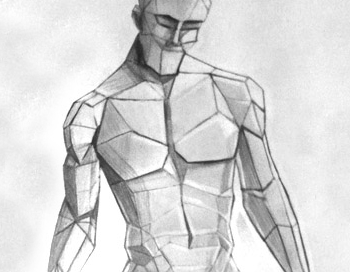
mackerman2019-02-13T18:37:03+00:00Life drawing courses were taken in an architecture setting. We focused initially on proper perspective and shadows. Later we began working with real models and focused on specific parts of the body. Materials include graphite, pastels, and colored pencil. Several courses in my collegiate years required sketches both of organic life and architectural structures. Practices of understanding perspective and contour lines were imperative when it came to physical art.


